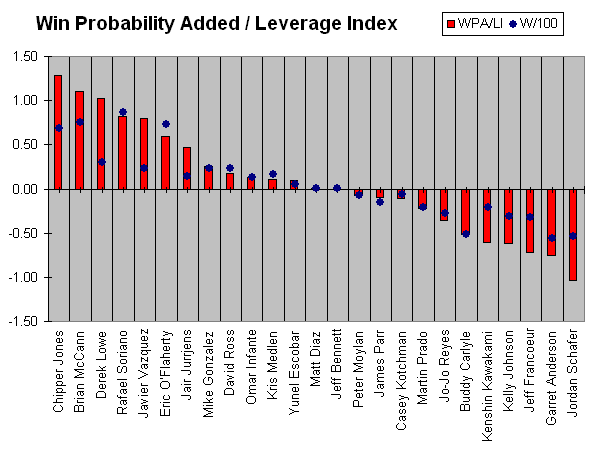
It’s been a while since I looked at Win Probability Added, since I’m not really keeping my own stats like I have in past years (I use Excel web queries of FanGraphs to get my data). No one would likely be surprised by the Braves’ leaderboard, which is topped by Jair Jurrjens and Chipper Jones.
WPA, as perhaps the king of all-encompassing stats, has some flaws. Defensively, it doesn’t consider the impact of fielding (at least it doesn’t on FanGraphs). The impact of closers and other elite relievers is magnified because of their typical usage patterns (late in close games). It’s also not very predictive because it includes the impact of clutch performance, which is highly variable.
If you’ve read this blog for any length of time, you’re aware of all that, and you also know that you can make an adjustment to WPA that removes the important clutch component. Dividing WPA by Leverage Index (LI), a measure of a situation’s importance, leaves us with something that’s much more predictive: WPA/LI. In simpler terms, WPA/LI tells us less about what happened and more about what’s likely to happen in the future.
Below, I’ve presented each Brave’s WPA/LI for the season. A WPA/LI of zero theoretically means that a team full of that player would play .500 baseball. A team with 25 players who have +1.0-win talent (over a full season) would finish 106-56, 50 games over .500 (+25 wins vs. 81 wins). I’ve also presented the same as a rate per 100 “events,” which would include plate appearances for hitters and batters faced for pitchers. I’ve called that W/100. Pitchers’ hitting is included in their totals, and stats are through Sunday.
(Note: If your monitor has a screen resolution lower than 1024×768, you may have trouble viewing the image. Try “zooming out” with your browser if you can’t see the whole thing. I didn’t want to reduce the size any more, since the bars and labels were already pretty small.)

The red bars are WPA/LI, and the blue dots are W/100. The only meaning to derive from the placement of the dots vs. the red bars is that some players have had more opportunities than others. Eric O’Flaherty stands out as an example of quality performance in limited opportunity. Lowe/Vazquez/Jurrjens stand out on the other end of the spectrum with positive performance over a lot of opportunities.
If the Braves could get Garret Anderson’s and Jeff Francoeur’s bars to look neutral, more like Matt Diaz, they’d be in business. It’s hard to believe that Anderson has been as bad as Buddy Carlyle on a per-PA basis, especially when that doesn’t consider his poor defense.
Speaking of Anderson, when I watch him track down one of those gappers, it really looks like he doesn’t care if he gets to it or not.
I wonder if he’s thinking “I’d rather be with the Angels.”
We could be kind and say that Garret is “less intense” than some other players out on the field. I really want to think that he just has very bad range, but plays like the triple (I think by Freddy Sanchez?) to left-center on Monday night make me think that he really doesn’t care much about playing the field.
There are very few circumstances where a player should ever get to third base on a ball hit to straightaway left-center. Maybe on a misplay that gets by the outfielder, but not on a routine gapper. He just couldn’t get himself in a hurry to get that ball to the infield, and the Braves paid for it with a sac fly by the next batter. One less run could have saved the Braves from playing six innings of extra baseball that night.
That play pushed me over into the “he just doesn’t care” camp. His low-key demeanor makes him a great fit for a Bobby Cox team, but being low-key is not a good excuse not to hustle.
Yeah. There’s a difference between low-key and low-effort.
Grannies with hoverounds cover more area than Garret.
Non-baseball comment:
I have to look at a lot of graphs of things, whether it’s in academic journals, textbooks, lectures, or whatever, and if my opinion counts for anything, I’d say this chart is one of the clearest and most informative visual presentations of a concept that I’ve ever seen. (Not that there’s anything wrong with any of your other charts, just that I particularly liked this one.) Anyway, nice job.
Baseball comment:
I hate to keep sounding like I’m defending Garret Anderson, but is there any way to tell how much of his low WPA performance might be due to his preposterously low BABIP, as shown by yesterday’s chart?
Thanks for the compliment on the chart. Some of them I like more than others, and this one just came together well.
I’m sure Anderson’s line would look better if those balls were falling in for hits. Hopefully they will start falling sooner rather than later, but I also hope the Braves are still surveying the market for another OF bat.
Maybe to be slightly more specific, does the raw data used for the WPA numbers indicate, for example, whether specific hits were line drives?
It does, although I haven’t been through the data for anyone in detail. If you go to a player’s page on FanGraphs, you can choose the “Play Log” tab under all his bio information and news headlines. Each play has a description and a specific note about what type of batted ball it was.
Some initial HITf/x data was released in the last week or so, which means that all the batted ball data we have now may soon seem rather simplistic. That data includes speed and angle off the bat, which the data we have now only roughly approximates.